Adaptive Reuse: Case Studies of Large Floor Plate Office/Commercial to Residential
Adaptive Reuse
Sustainability. Housing. Community.
Amid the ongoing housing, climate, and public health crises facing our world today, the spaces affecting our lives are undergoing tectonic and likely irreversible shifts.
Since our founding in 2009, we at Omgivning have been committed to exploring the design needs of this new era and becoming increasingly convinced of the importance and urgency of reusing existing buildings. Adaptive reuse architecture breathes new life into existing structures by repurposing them for new use. And as Omgivning knows, and so many more are now learning, adaptive reuse makes for more sustainable construction, more thriving communities, and more creative solutions to the pressing issues found in cities everywhere.
A recent AIA Firm Survey found that almost half (48%) of all projects currently being pursued by U.S. firms involve the renovation, rehabilitation, extension, or preservation of existing buildings. In fact, according to Bloomberg, for the first time in 20 years, renovations have overtaken new construction in architectural billings in the U.S. Omgivning's focus on the creative reuse of commercial spaces allows us to help clients navigate this unprecedented landscape with innovative and cost-effective solutions.
As with all of our work, the goal of this design report is to inspire people to take a closer look at the potential of an existing space or property. Together, we can reveal and attain a site's highest and best use, even under challenging conditions.
Case Study #1
1980s Office Building
With a less in-demand location, a somewhat dated style, and a high vacancy rate, this 1980s-era high-rise office building in Pasadena, California, would make a perfect candidate for conversion to housing. While most developers, landlords, and corporations are flocking to Class A office buildings – what many are calling “the flight to quality” – to entice employees to come into the office, many Class B and C buildings like this one are being left underutilized.
While not located in a business district, this building is not entirely suburban either, sitting just a few miles from both downtown Pasadena and Los Angeles. As a more recent building, it’s in great shape with little to no structural or access upgrades necessary and has a large adjacent parking structure.
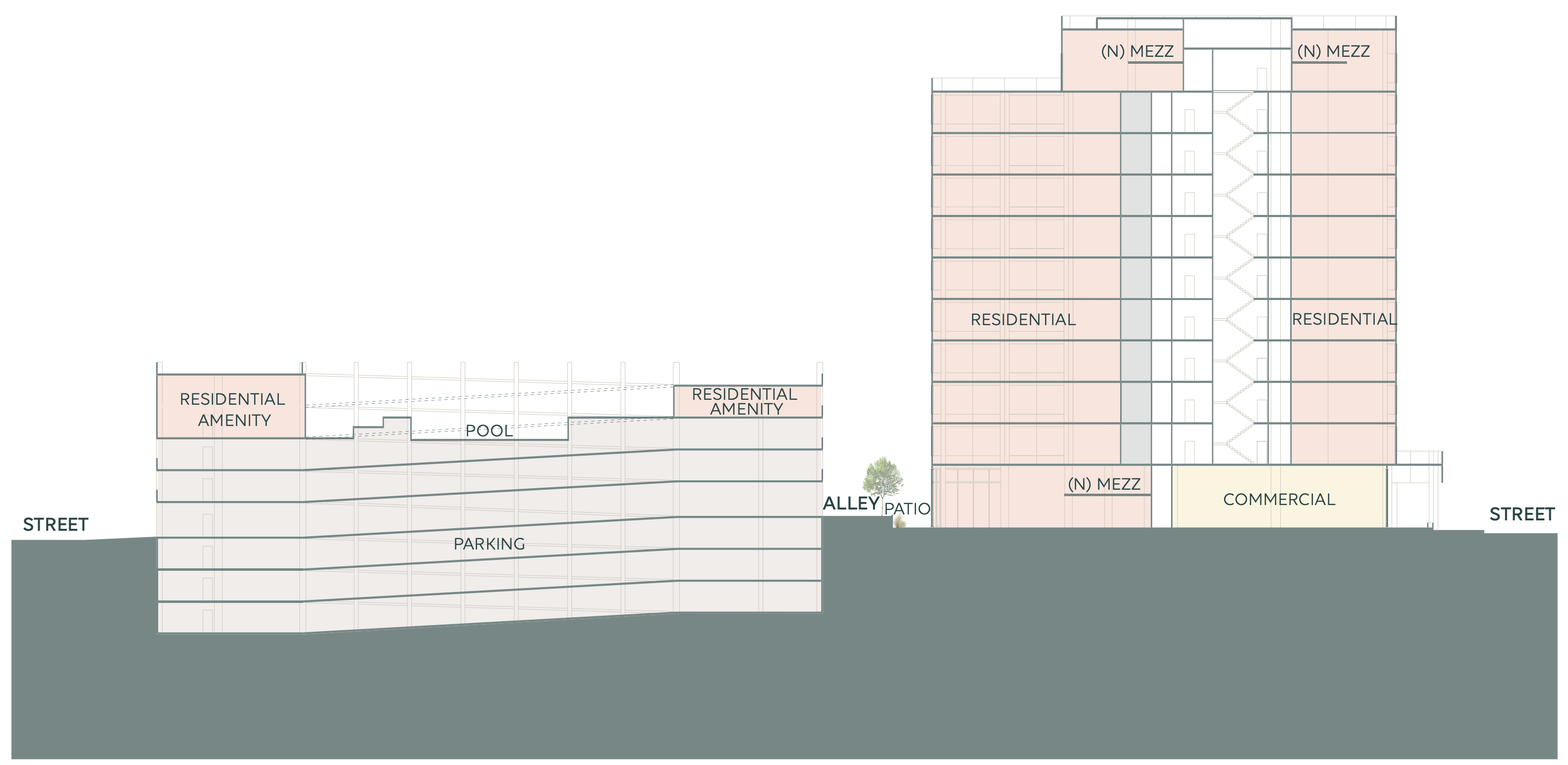
The inside of the office building could easily be converted into residential units. Interior walls on each office floor would be removed, leaving just some stairwells and elevators to suit the reduced amount of traffic. Units would be designed in sync with existing windows. Additionally, the side or back of the double-height ground floor commercial space could be converted into 2-level units with private or shared outdoor space on the alley or side yard.
On the roof of the building, to avoid triggering seismic upgrades or other costly improvements, we wouldn't build a new construction penthouse or add new occupancy on a roof that was formerly just used for mechanical units. Instead, the roof of the parking structure would be a perfect location for a large number of new residential amenities. Re-purposing the existing mechanical penthouse on the roof of the tower would be a great location for a unique two-level or swanky double-height penthouse unit with an amazing outdoor terrace. This would create a high-rent unit and likely keep code upgrades to a minimum.
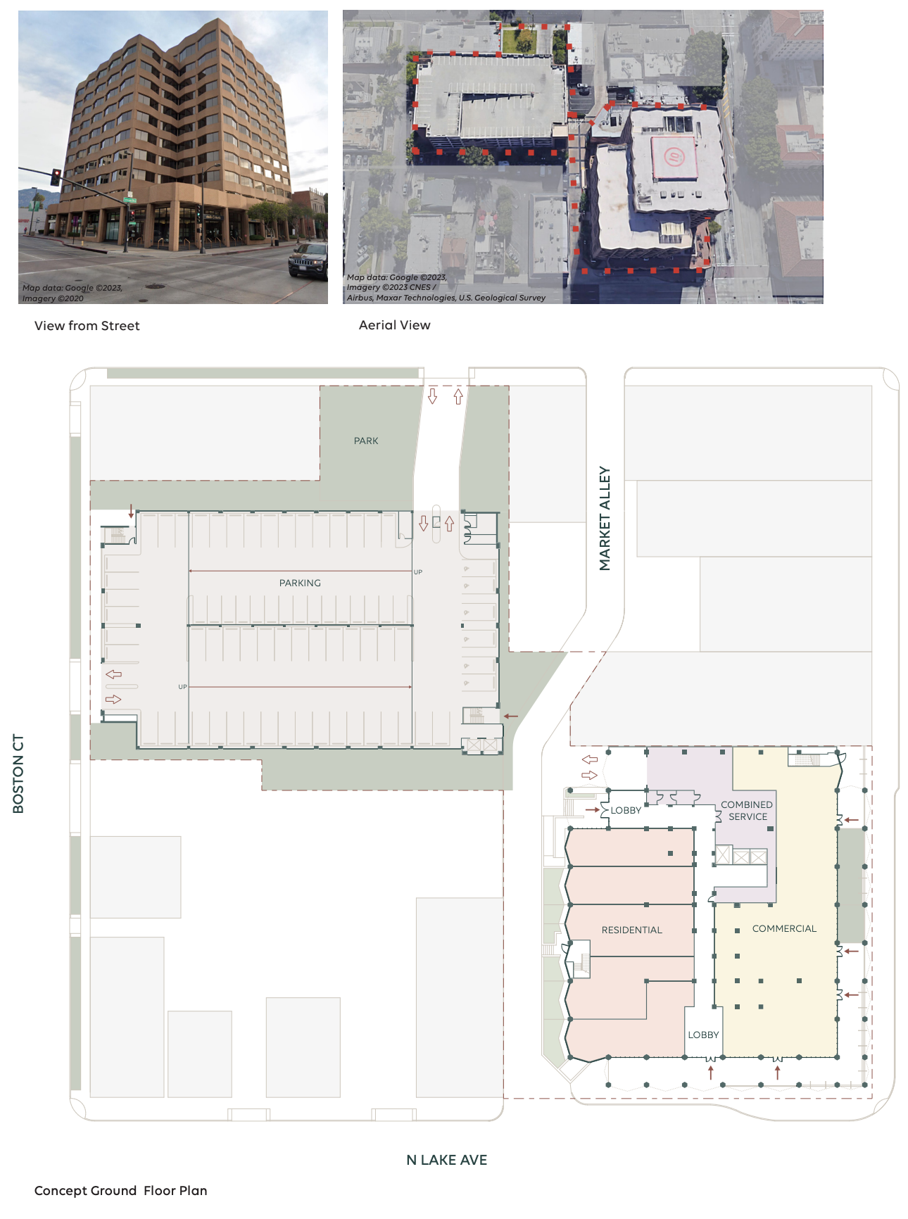 With significantly more parking than would be necessary for residential, this allows for more space to work with. If it weren't sloped, we would turn the parking garage into housing. By adding or removing a floor or two, we would remove mass and then rebuild a bevy of residential amenities such as a pool, lounge, or fitness areas. The new roof addition could also be used as commercial space, perhaps as a big restaurant with ample outdoor dining.
Another option could be keeping the parking garage as is and sharing parking with adjacent restaurants, retail, or the surrounding neighborhood.
Case Study #2
Large Industrial Building
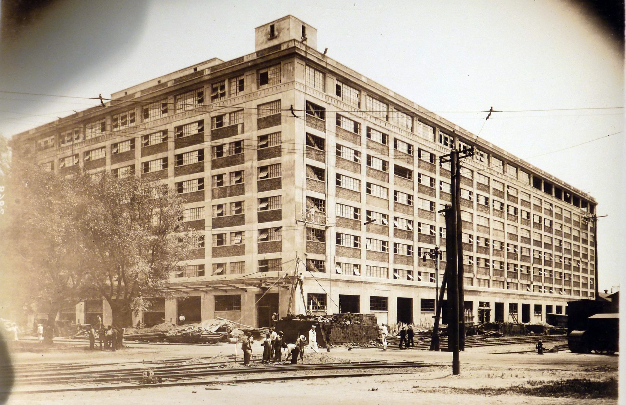 Located in Philadelphia, Pennsylvania, this large industrial building is located in a former Navy yard and measures over 500,000 square feet. Originally used as a manufacturing facility for tanks, the building was designed to hold a great deal of weight.
Since modifying a large concrete building can be prohibitively expensive, we would start by listening to the building. Our first consideration would be that the building was over-designed for gravity loads so that it could
easily house cars on any floor, and since this building is located in a new district with a lot of new construction, there is a need for parking on-site. The shortest depth of the building at 182 feet would allow ample room for parking to be created in the center of the building, allowing residents to park on the floors where they live and the existing freight elevators reutilized as car elevators, creating a unique and attractive amenity.
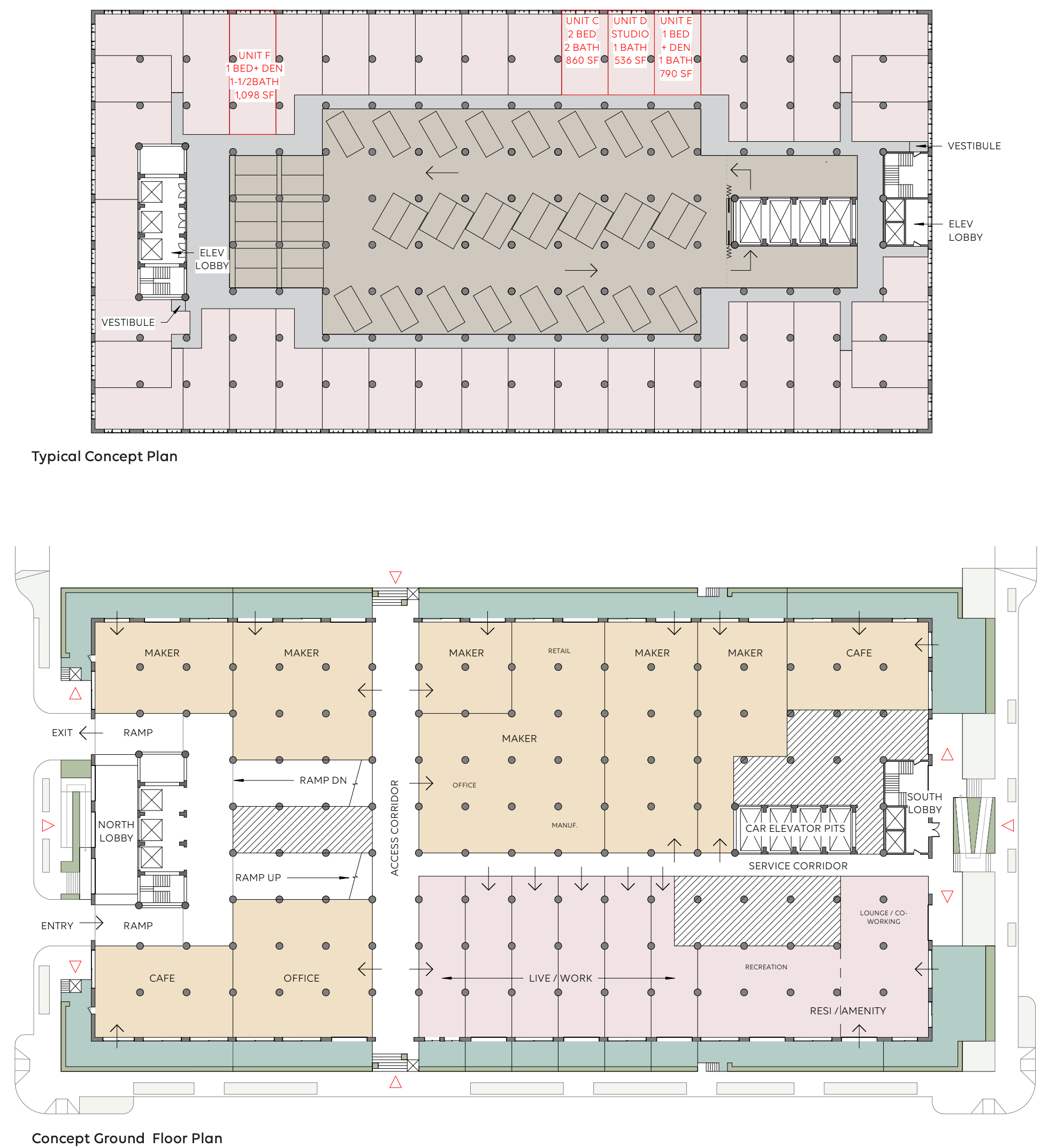
Many architects’ first thought would be to carve out a big light court, however, any significant modification to the structure would require an extremely expensive full structural upgrade, which would not be necessary if the existing structure was reused as is. Our design would provide units all along the perimeter of the building to maximize the expansive windows. It would also focus on a mix of units each with ample daylight flooding into the space.
The ground floor is intended to be flexible for makerspaces, as well as residential space - essentially a blend of true live/work. The loading dock would be reused for either private patios or semi-private circulation.
Case Study #3
Phasing Office and Residential
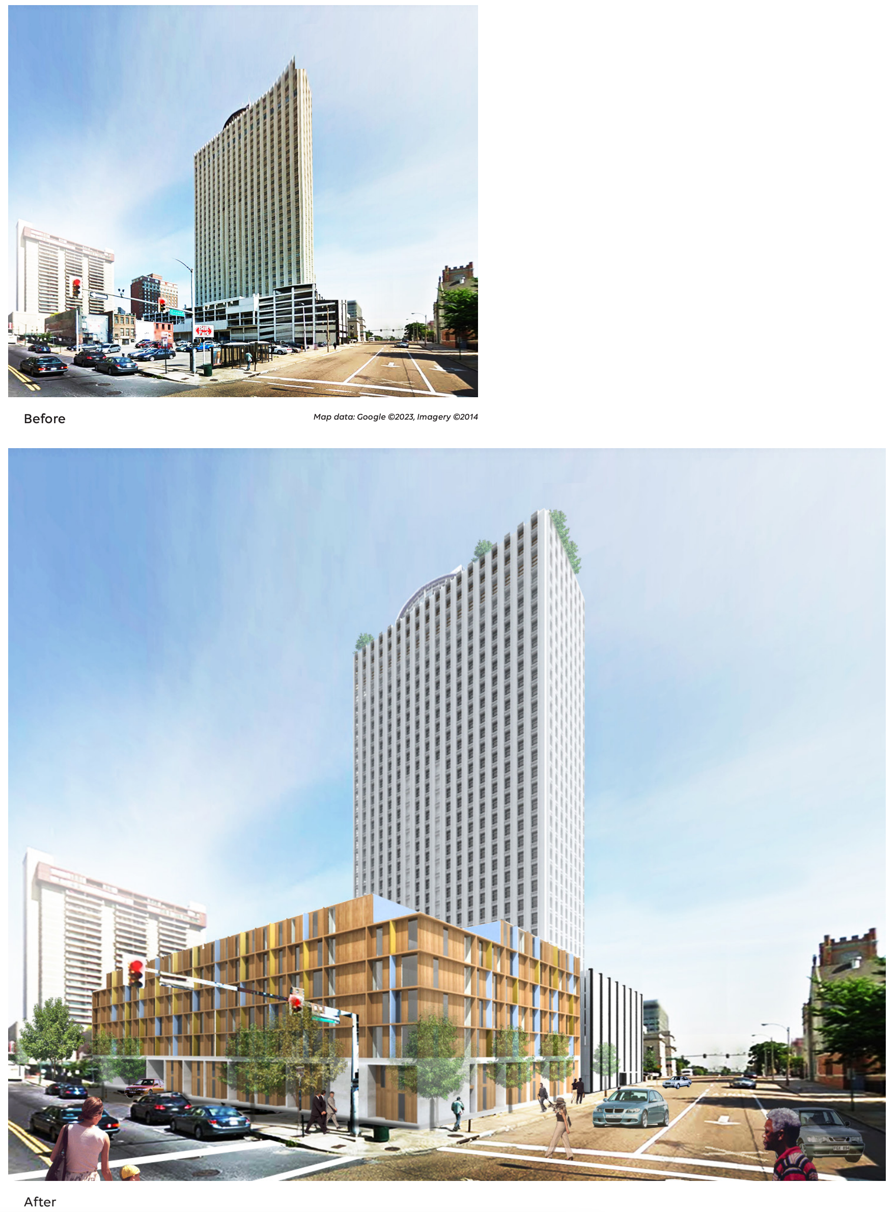
In the center of downtown Memphis, Tennessee, the 100 North Main site – dubbed Memphis Main – is a prime location for mixed-use redevelopment and phased, flexible residential conversion. Originally built in 1965, the 37-story office building is one the city’s tallest at 579,000 square feet, including adjacent parcels covering more than two acres including some small, but long, brick buildings and a large surface parking lot.
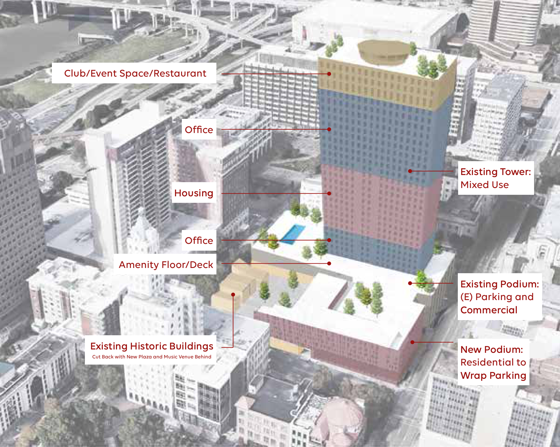
Located in a neighborhood that isn’t fully revitalized, but adjacent to a pedestrian-friendly entertainment district that is gaining traction, the site would easily meet the larger need for housing in the area. We would start with the area surrounding the tower and phase housing into the building itself over time.
By designing a public plaza and opening the corners of the site up, Memphis Main would connect to the burgeoning Main Street, increasing pedestrian engagement and making the area more attractive for both potential residential and office tenants. We would populate the plaza with program-specific uses such as a music venue, so as not to add too much additional commercial space which could be at high risk for vacancy. The existing revolving restaurant at the top of 100 North Main – with incredible views of the city – deserves to be a destination for locals as well as those coming into town. The core/shell of the top iconic floors would be flexible for a variety of large occupancy uses such as the city’s hottest club, restaurant, or event space.
An existing surface parking lot would be a prime site for new construction to add even more housing, installing townhomes on the site’s side streets and, yet again, activating the ground floor without leaning on high-risk
commercial spaces.
